Problem
Many amateur creative writers struggle with writers' block, preventing them from starting and finishing work they care about.
Solution
Lightning Write is a website that helps amateur writers get started on their next project by providing a focused, judgement-free space to turn ideas into words.


The challenge
As an aspiring and amateur writer, I’ve struggled with writers’ block all my life. Even during the COVID-19 pandemic, with lots more time to spare at home, I still found it difficult to sit down and get started on writing.
I challenged myself to understand and develop a solution to this issue of writers’ block—both for myself, and for other amateur writers struggling to write during the pandemic. Specifically, I sought to:
Understand why amateur creative writers suffer from writers’ block.
Design a solution that helps amateur writers overcome writers’ block.
Code said solution as a functional web app.
Why code? As the pandemic was causing people real stress, I wanted to try my hand at creating a tool that could tangibly help people, rather than just showing off a static design concept.
Process
I approached the challenge using an iterative and nonlinear design process inspired by the Design Sprint methodology pioneered by Jake Knapp at Google Ventures.
Some key principles of this process include:
a bias toward action,
creating and validating an MVP through rapid user testing and research, and
embracing iterative change.
Researching the problem
Interview methods
To understand writers' pain points, I conducted a total of seven qualitative interviews:
Four with the target user base, i.e. college-aged amateur writers, about their various feelings and behaviors around their writing habits, especially during the pandemic.
Three with "field experts"—professional writers and educators—on what makes a successful (and unsuccessful) writing process.
Selected sample questions:
Have you been writing lately?
If so: what are you aiming to accomplish by writing this?
If not: what's been stopping you?
What was the last project you completed to your satisfaction?
What are some obstacles that have prevented you from writing?
Key insights & observations

The key findings from these interviews were as follows:
Creative writing is a personal and emotional activity. An oft-cited reason was that it lets writers resonate with their younger self.
Interviewees dropped projects when they struggled to reach their expectations (which were, many times, too high).
Avoidance and procrastination are signals of perfectionism, and in turn, a failing writing project.
Structured, controlled writing environments, such as classes and workshops, were where writers succeeded most in finishing projects they cared about.
“It's been a stumper...usually, I try to write lyrics that sound fresh and new, but I end up writing something that's already been written.”
“I like that environment of a closed box of a class… everything kind of just exists in that class, so I was able to throw out spontaneous, impersonal ideas”


Designing a solution
Ideation
I hypothesized that two things were key to overcoming an inability to write:
Deliberate, specific constraints and
Generative improvisation.
For visual design inspiration, I looked to other writing and productivity apps. WYSIWYG word processing tools, like Medium and WordPress’s Gutenberg editor, emphasize minimalist spaces to facilitate a feeling of craftsmanship. Productivity apps such as prodcard.co provide discrete options to minimize decision fatigue.

Finding the right design
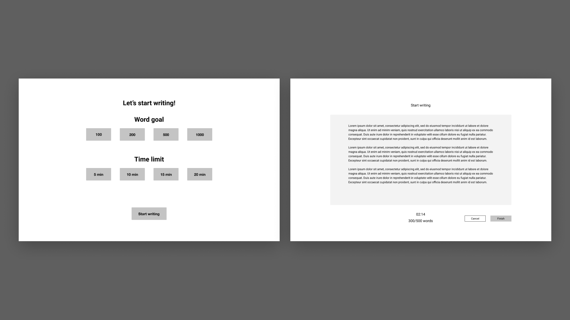
I came up with a user flow outlining how the tool might help a writer tackle their work in more digestible parts.

The aim was to help writers get in their natural writing flow while avoiding dwelling on their work for too long, using the help of constraints like a timer and word counter.

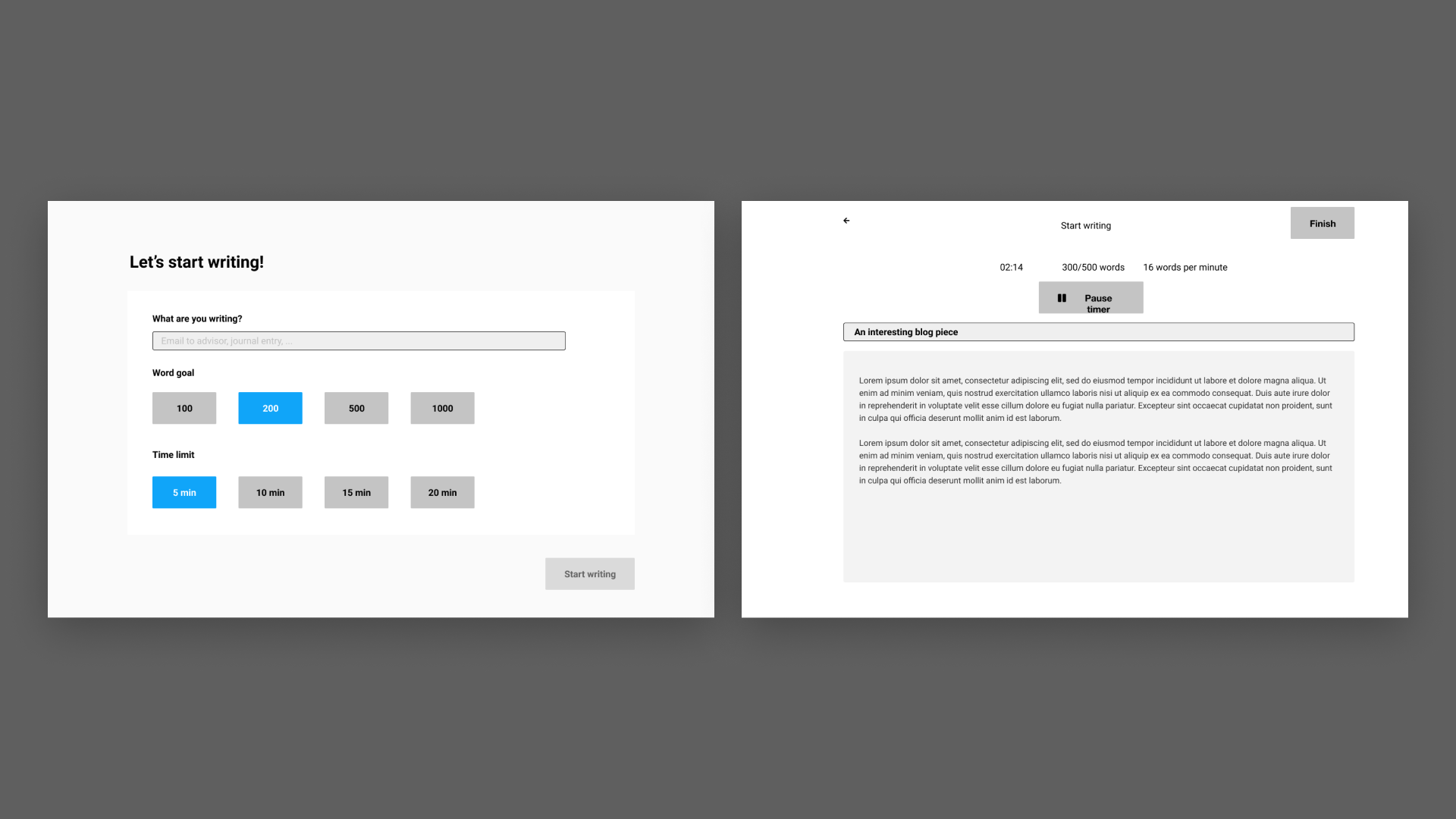
At first, I wasn't certain about how exactly the features should appear visually. Testing was a good opportunity to clarify this, by seeing how testers responded to certain design choices or features.
To test the app, I got on a video call with participants and asked them to write a short piece about a topic of their choice using the app, while narrating their thought process.


As a bonus: about a year after I had originally finished working on Lightning Write, I revisited the screens just to test the UI design skills that I'd picked up since then.

The one-man team's design system
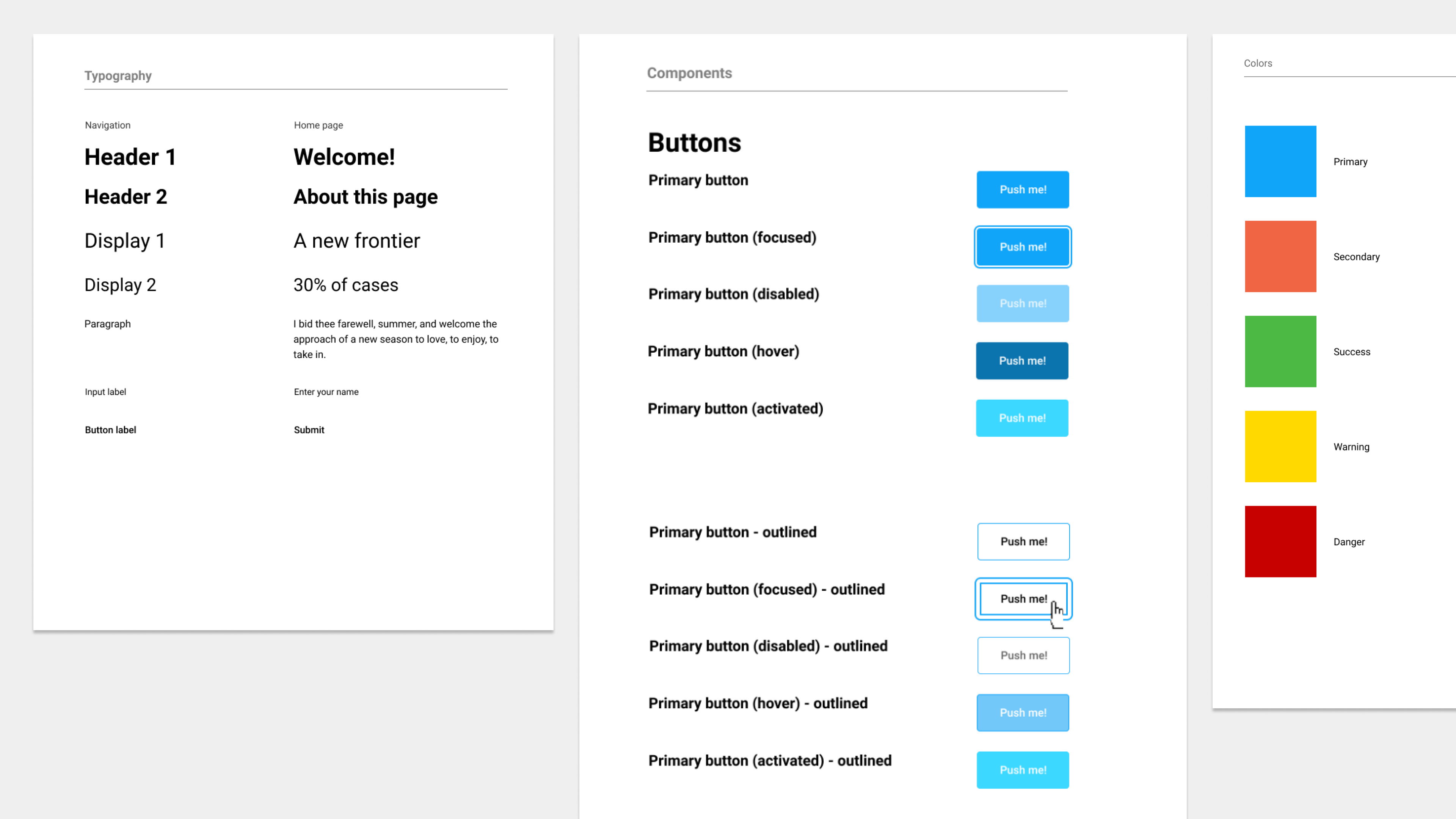
Design systems are typically used by large organizations to handle complex products. However, I found a design system to be super helpful in my comparatively small personal project. This is due to two main constraints I faced with this project: I was the sole designer, and I wanted to code the product.

This was my first shot at creating a design system, and it required a ton of overhead in addition to designing the actual product. That said, it came with some noticeable benefits:
Organized: like a second team member reminding me how to understand the product
Iterative: optimized less for instant perfection, and more for gradual improvement
Deliberate: providing clear rules for when and how elements should appear
Developing the prototype
As I mentioned earlier, the crisis of the pandemic meant that I felt it was right to create a solution that could actually help people. That's why I coded an interactive prototype in React to test the design.
The tech stack included:
JavaScript and TypeScript
React frontend (via Create React App)
SCSS for styling
You can see the source code on the Lightning Write GitHub respository.
Cutting down on dev time
For Party Mode for Spotify, I also created a code prototype, which was great for testing the app, but came at some major time costs:
I coded it from scratch, which meant spending excessive time creating simple components such as buttons.
I didn’t create a proper design system, which meant that similar elements around the app were redundant, incompatible, or difficult to reuse.
By having a design system beforehand and focusing on reusing components, I was able to cut the time to finish a working prototype to around 2 weeks (compared to 5 with Party Mode).
Still, I feel that I can cut down on that time even further to be more in line with the design thinking ethos of rapid prototyping. In the future, I might consider ways to incorporate interactivity without having to code, or at least tools that reduce the time it takes to code from scratch.
Reflection

When I started this project during the early pandemic, I sought to explore a way to help people cope with the looming uncertainty. I learned a lot about research, design, and code in the process, particularly:
Interactive, functional prototyping. The interactive prototype solicited important user feedback that may not have been possible with static screens—for instance, a feeling of pressure from watching the timer count down in real time.
Translating designs into code. Because I had planned to code this project from the start, I invested a lot of time and effort into keeping the design file and code well-organized and in sync.
I also discovered a lot of areas that I'd want to improve on for future projects, such as:
More rigorous, long-term user testing. I managed to solicit feedback largely based on people’s 20-minute impressions of the prototype, but it would be useful to test how effective it is in improving their writing habits over a longer period of time, e.g. the span of a few weeks.
Assessing the perfectionism problem across different types of writing. I approached this project from the angle of creative writing, but I'd also like to study its effectiveness with less creative and more utilitarian writing tasks, like emails, essays, or letters.
If you would like to use the app yourself, try it out at http://lightning-write.surge.sh. I'm always open to feedback, questions, or comments about the product or the case study, so feel free to send me a message.
Thanks for reading!
